Analyzing NYC Subway Data with Python

MTA provides a public dataset of turnstile data per station since May 2010. We can grab weather data from Weather Underground, who kindly provides historical weather data in CSV format. You can also grab the same data through their API.
Data Munging
The data we collected so far usuable yet, so we'll have to do a bit of data munging.
The MTA data has multiple entries per row, so we should first unwind the data so we get an entry per row:
import csv
import os
with open("masterfile.csv", 'wb') as outfile, open("data/maynycweather.csv", 'wb') as weather:
	outWriter = csv.writer(outfile)
    outfile.write('C/A,UNIT,SCP,DATEn,TIMEn,\
    DESCn,ENTRIESn,EXITSn\n') # column names

	for name in os.listdir('./turnstile'):
	with open('./turnstile/' + name, 'rb') as infile:
		inReader = csv.reader(infile)
		for row in inReader:
			for i in xrange(3,len(row),5):
				outWriter.writerow(row[0:3] + row[i:i+5])
For simple manipulations, the csv module will usually suffice. However, doing more complicated operations, such as calculating aggregates or dealing with different datatypes like DateTimes can be difficult and tedious. This is where pandas saves the day!
import pandas
import datetime

def reformat_weather_dates(date):
	return datetime.datetime.strptime(date,\
    '%Y-%m-%d').strftime('%Y-%m-%d')

def reformat_subway_dates(date):
	return datetime.datetime.strptime(date,\
    '%m-%d-%y').strftime('%Y-%m-%d')

df = pandas.read_csv('masterfile.csv')
dfweather = pandas.read_csv('data/nyc052013.csv')
df = df[df['DESCn'] == 'REGULAR'] # Filter by REGULAR
df['ENTRIESn_hourly'] = (df['ENTRIESn'] - df['ENTRIESn'].shift(1)).fillna(1) # Calculate daily entries
dfweather.rename(columns={'EDT':'DATEn'}, inplace=True) # - rename column names so they can merge
df['DATEn'] = df['DATEn'].map(reformat_subway_dates) # - reformat so dates match using map
dfweather['DATEn'] = dfweather['DATEn'].map(reformat_weather_dates)
final = pandas.merge(df,dfweather,on='DATEn')
final.to_csv('final_master.csv')
We can easily filter by specific categories. For example, we'll only want turnstile data from the category of 'Regular':
df = df[df['DESCn'] == 'REGULAR'] # Filter by REGULAR
This grabs all the indices of rows that match 'REGULAR', then regrabs the rows from the original frame.
# Calculate daily entries
df['ENTRIESn_hourly'] = (df['ENTRIESn'] - df['ENTRIESn'].shift(1)).fillna(1)
Exploring the Data
One way to get a sense of our data is to visualize it. Here, we'll try out ggplot, a port of the popular R graphing library.

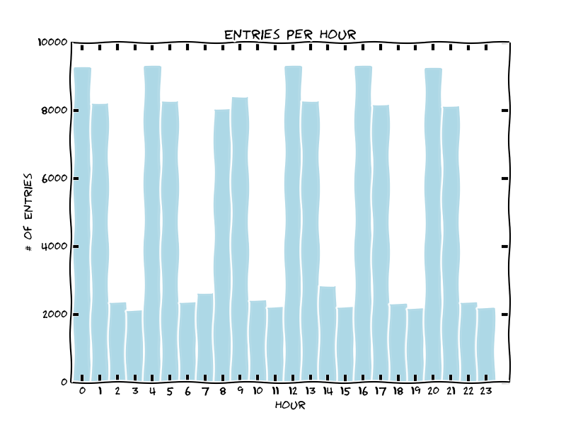
Entries seem to peek during specific two-hour windows. This seems to correspond to peak operating times, like rush hour (8-9am and 4-5pm), lunch and dinner etc...
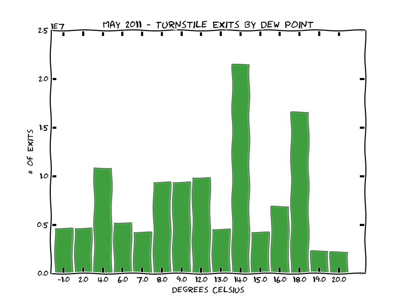
We can also look at comparing ridership relative to weather, like how many people exit stations relative to the average humidity.
from pandas import *
from ggplot import *

df = pandas.read_csv('./turnstile_data_master_with_weather.csv')

df['meandewpti'] = df['meandewpti'].map(lambda x: round((x-32.0)*(5.0/9.0),0))

daily = df.groupby(df.meandewpti).EXITSn_hourly.sum()
daily.index.name = 'day'
daily = daily.reset_index()

p = ggplot(daily, aes('day', weight='EXITSn_hourly',alpha=0.5)) + \
geom_bar(fill="green") + \
theme_xkcd() + \
ggtitle("May 2011 - Turnstile Exits by Dew Point") + \
xlab("Degrees Celsius") + \
ylab("# of Exits")
print p

Don't think we can infer much from the plot, except most the most popular days in May had a humidity around 14-16°C.

Member discussion